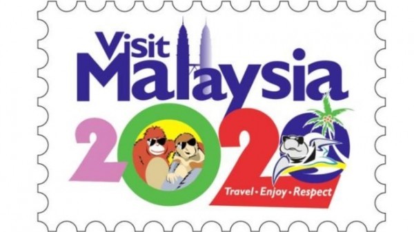
Just last month, the Malaysian Tourism Board faced immense ridicule after unveiling a logo featuring a grinning orangutan and a turtle in sunglasses. The new logo, with its tagline ‘Travel. Enjoy. Respect’, came under fire on social media with people criticising the uneven font sizes and retro-looking illustrations, and almost 8,000 people signed an online petition calling for it to be dropped by the tourism board.
While the backlash in this case was unprecedented, this is in no way the first dodgy tourism logo or slogan to have given everyone a good laugh or a cause to fume.
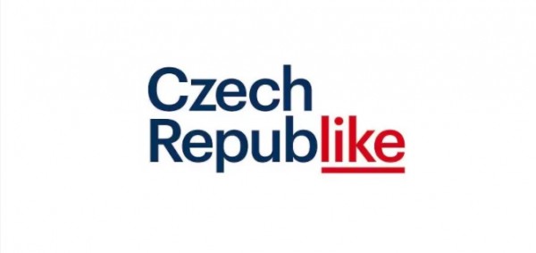
In April 2016, the Czech Republic created a new marketing logo to promote the country. Apart from the fact that the logo itself is quite boring, it drew a lot of criticism on account of ignoring those holidaymakers who don’t speak English or have a Facebook account. Many said that while it looked clever on paper, and was amusing for a single-use print ad, but it certainly did not make the cut for being a long-term brand identity. Moreover, given the natural and cultural beauty of the Czech Republic, people thought it felt like a ‘disservice to present it in such a neutral and aseptic design’.
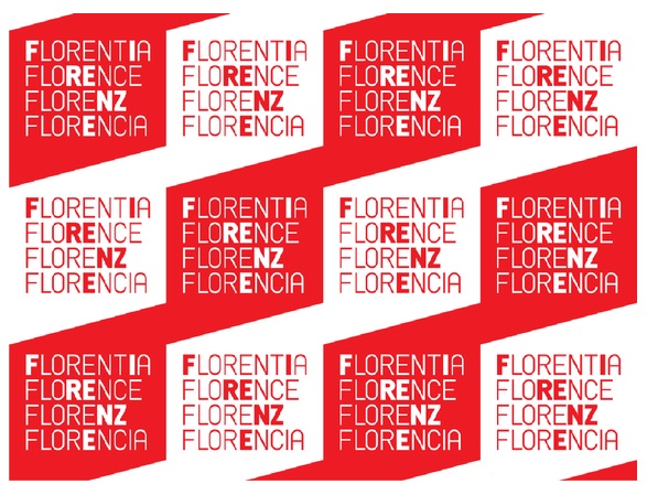
In 2014, the Italian city of Florence held an open contest to rebrand itself, and garnered an impressive 5,000 entries. However, according to many people, the results were less than memorable, and the way the concept was executed raised a lot of questions about the interaction of politics, business and design. The winning logo showed four different language spellings of Florence, but the concept was thought to be uncomfortably similar to the identity for city of Prague, which uses four foreign spellings of the city. The entire contest also faced criticism as it appeared to be exploiting designers for a €15,000 prize in return for surrendering all rights to the work, which would otherwise fetch higher prices in the market.
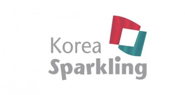
Back in 2012, South Korea was trying very hard to change the country’s international image. While thinking about its national brand, it was facing some unique challenges, like sharing the name ‘Korea’ with North Korea, which at that time, was very confusing for people to comprehend. The country launched a flurry of marketing campaigns describing South Korea – and its capital city, Seoul – as ‘sparkling’, ‘dynamic’, ‘infinitely yours’ and the ‘Soul of Asia’, appearing on billboards and TV channels around the world. However, despite the extensive advertising campaigns, many people felt the marketing was unsuccessful as the logos and branding imparted no clear message. There were too many conflicting images which kept changing all the time. Moreover, the word sparkling was not easy to interpret for many people.
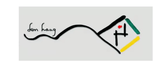
A decade ago, The Hague, one of Netherland’s most beautiful places, unveiled a new logo that would supposedly reflect a modern, cutting-edge sensibility that catapults it into the 21st century. However, the logo that was supposed to express feelings of security, life, progress and playfulness, lacked all of these elements. Many citizens questioned ‘are we even going to call it a logo?’, while some even felt their ‘nephew could knock this out with some water colour paint and a ball point pen’, and some thought the results were ‘uninspired and directionless’.
What do you think of these logos?