
At BlaBlaCar simplicity is in our blood. We spend our days designing and building a product that’s easy, that’s simple to use.
Content plays a huge part in this. In my role as Product Content Specialist, I hold a large part of the responsibility for making our website and app as simple as possible. When you use BlaBlaCar to find people to share a city-to-city car journey, we need you to understand our words and understand them straight away, with no effort.
There are many ways we do this — keeping each sentence short, sticking to one message, limiting the number of possible actions, using consistent terminology. But the thing that has really made the difference for us, is keeping it obvious.
Being obvious is about being precise, being unambiguous. But most importantly, it’s about not allowing the user to make any assumptions. If you leave them in any doubt, you can easily find them using your product in completely the wrong way.
And I know this all too well. Let me tell you the story of one of our most recent features, and what happened when we didn’t make our content obvious enough.
The feature in question is Govt. ID verification. We recently developed this feature so that BlaBlaCar members could upload an identity document, which is then verified. Their BlaBlaCar profile then shows that they’ve verified their Govt. ID, and increases their trustworthiness in the eyes of other members — an essential attribute for a user of our peer-to-peer ridesharing platform.
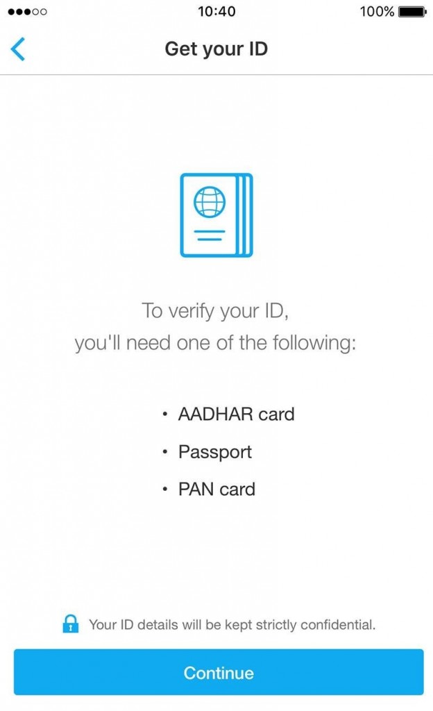
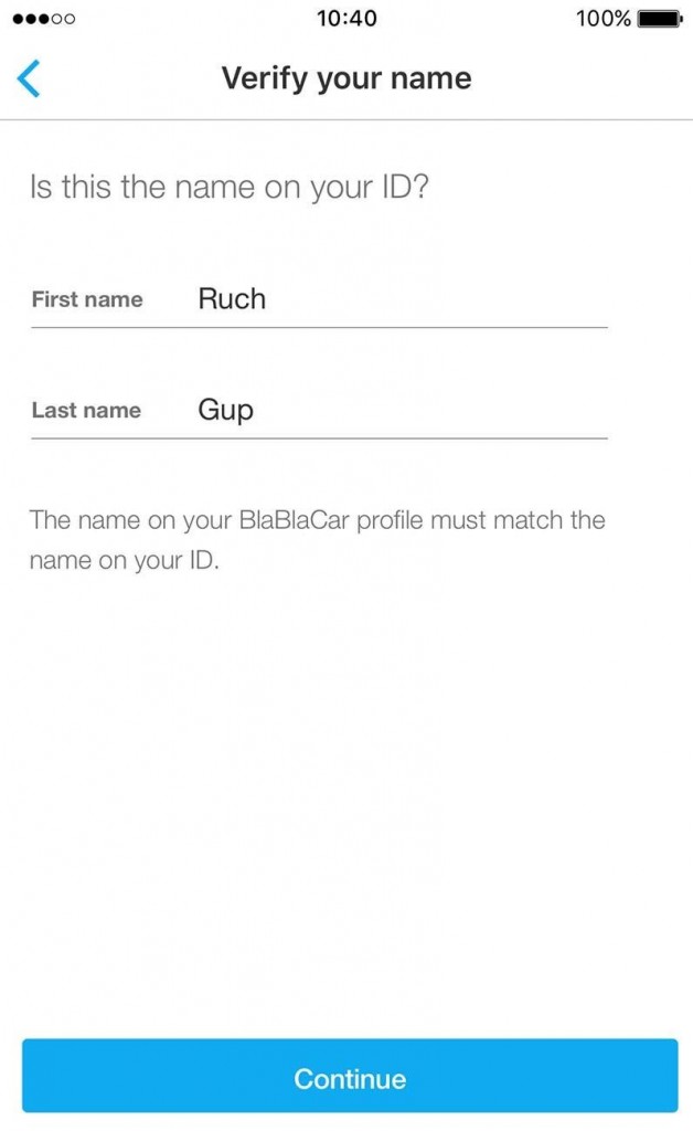
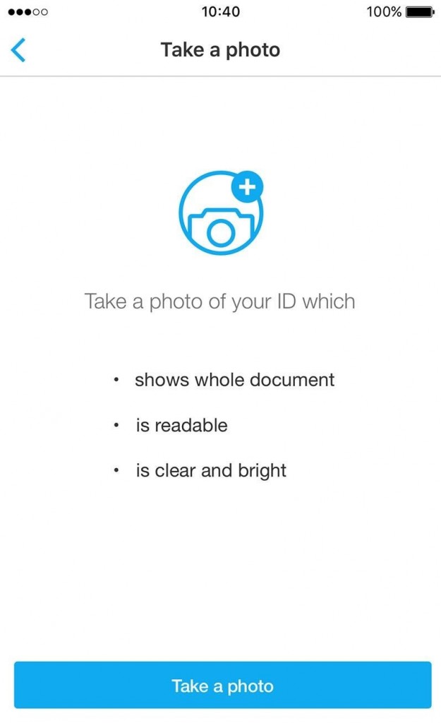
On our mobile app, we built a flow to allow members to upload their Govt. ID in three steps. First, we told them what types of Govt. ID they could use. Second, we showed them their name as it appears on their BlaBlaCar profile, and asked them to make sure it matched the name on their ID. Finally, we asked them to take a photo of their ID and submit it for verification. This is what it looked like:
Step 1 — Get your ID
Step 2 — Verify your name
Step 3 — Take a photo
Our users did something we never expected.
So it seems pretty simple, right? But remember, you’ve got the context. I’ve just explained to you the whole purpose of the feature and how it’s supposed to work. The first members who used this feature didn’t have that much detail. And they did something we never expected.
Take a look at the flow again — any idea where and how they went wrong?
Well, they took selfies. Photos of themselves, instead of photos of their Govt. ID, which they then submitted to us. And when you look back at the third step, you can see why. The call-to-action button was asking them to take a photo.

So they did.
By focusing too hard on giving a direct explanation of the next action the user would have to take, we left room for them to make assumptions. And the most common assumption was, “I have to take a photo now, that must mean a photo of me”. And when you consider that most users scan screens at the speed of light, especially in one-screen-one-action flows such as this, it’s hardly surprising they made this assumption.
So how did we fix the problem? Well, we simply changed the wording on the call to action of step 3 to “Upload my ID”.
Making the content more obvious made for a simpler product and a more successful user experience.
Whereas the previous “Take a photo” had led to incorrect assumptions, its replacement “Upload my ID” leaves no doubt. It may not tell the user exactly what’s going to happen next, that they’re going to be taken to a camera functionality, but that doesn’t matter. They’ll realise that when they get there. At least now, they’re in no doubt about what we need them to take a photo of.
And it worked! The number of correctly uploaded IDs increased by 140%. Making the content more obvious made for a simpler product and ultimately a more successful user experience for our members.
You’ve really got to make it obvious. Often far more obvious than you think. If you leave any room for doubt, users make assumptions, and interpret what you’re telling them based on their habits, their intuition, their initial split-second reaction. But if your content is obvious, if it can only be interpreted in one way, your users will get the best possible experience out of your product.
Author
Paul Stairmand is Content Specialist at BlaBlaCar, the peer-to-peer ridesharing platform. He’s a designer… of words. He crafts the words for the BlaBlaCar website and mobile apps, creating the content that makes the UX design work. He believes that good content makes users understand things without knowing there was anything to understand.
This post first appeared on Medium and has been republished with author’s permission.